
Zarori Brand Identity
Zarori, an emerging brand based in India, is dedicated to offering a distinct collection of spices, pickles, and culinary ingredients. Our agency was tasked with developing a complete brand identity from the ground up. The challenge was to create a visual language that would resonate with the Indian market, convey the authenticity and vibrancy of Zarori's products, and establish a memorable presence.
Branding
Logo Design
Know More
Crafting a Flavorful Brand Identity for Indian Spices & Ingredients.
The Design Vision & Objectives:
Our goal for Zarori's brand identity was to:
Create a visually appealing and distinctive brand that stands out in a competitive marketplace.
Reflect the rich culinary heritage of India and the natural quality of Zarori's ingredients.
Develop a flexible system that could be applied cohesively across a diverse product range.
Instill a sense of trust, quality, and flavor exploration in the target consumer.

Our Strategic Design Approach:
We approached the Zarori brand identity by focusing on elements that evoke nature, tradition, and culinary delight.
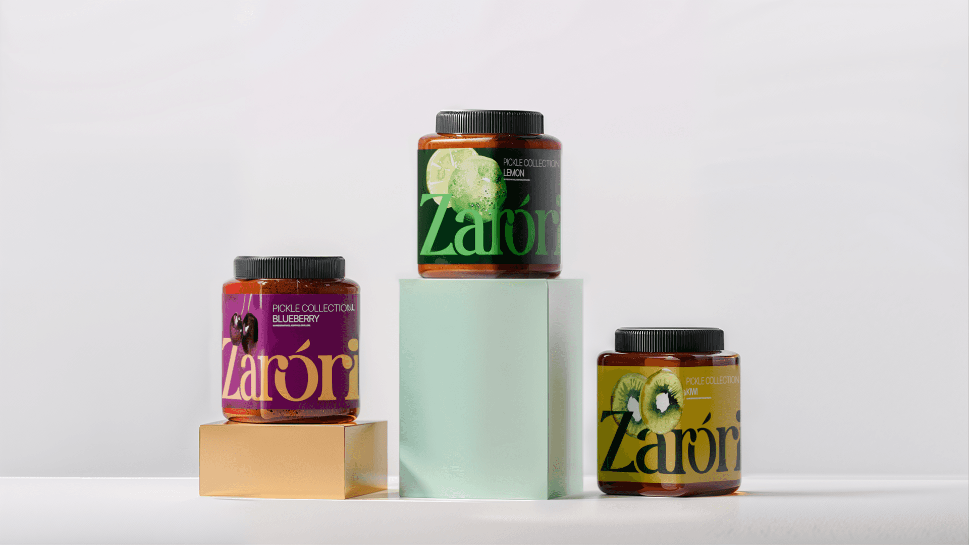
Logotype Development: The "Zarori" logotype was crafted with an elegant serif typeface, lending a touch of sophistication and timelessness. Close attention was paid to the letterforms, ensuring a unique and balanced mark that is both legible and distinctive.
Color Palette: We selected a vibrant and earthy color palette. The warm orange evokes zest and culinary warmth, while the deep green and product labels) connects to natural ingredients and freshness. These primary colors are complemented by varied shades on product packaging to differentiate flavors (like the blueberry and kiwi variants in.
Pattern Design: A system of organic, swirling patterns was developed as a key visual element. These motifs, visible in both orange and green iterations across backgrounds and packaging, add a layer of texture and visual interest. They suggest the richness of natural ingredients, the art of cooking, or traditional Indian artistic forms, providing a unique and ownable brand texture.
Packaging System: The brand identity was designed with a strong focus on its application to packaging. As seen on the jars, the logotype, patterns, and color system work harmoniously to create an attractive and informative product presentation that stands out on shelves and clearly communicates the product variant.

Key Elements of the Zarori Identity:
Refined Logotype: A custom-feel serif that balances tradition and modernity.
Vibrant & Natural Colors: A palette that speaks to the Indian context and the nature of the products.
Signature Organic Patterns: Adding depth, cultural resonance, and a unique visual flair.
Cohesive Packaging Design: Ensuring brand recognition and appeal across the entire product line.

Crafting Zarori's Brand Experience:
The comprehensive brand identity for Zarori aims to provide a sensory cue to the quality and flavor packed within their products.
By balancing traditional influences with contemporary design aesthetics, we sought to create a brand that feels both authentic to its Indian roots and appealing to modern consumers, inviting them to explore a world of rich tastes with Zarori.

More Works


FAQ
01
What does a project look like?
02
How is the pricing structure?
03
Are all projects fixed scope?
04
What is the ROI?
05
How do we measure success?
06
What do I need to get started?
Zarori Brand Identity
Zarori, an emerging brand based in India, is dedicated to offering a distinct collection of spices, pickles, and culinary ingredients. Our agency was tasked with developing a complete brand identity from the ground up. The challenge was to create a visual language that would resonate with the Indian market, convey the authenticity and vibrancy of Zarori's products, and establish a memorable presence.
Branding
Logo Design
Know More
Crafting a Flavorful Brand Identity for Indian Spices & Ingredients.
The Design Vision & Objectives:
Our goal for Zarori's brand identity was to:
Create a visually appealing and distinctive brand that stands out in a competitive marketplace.
Reflect the rich culinary heritage of India and the natural quality of Zarori's ingredients.
Develop a flexible system that could be applied cohesively across a diverse product range.
Instill a sense of trust, quality, and flavor exploration in the target consumer.
Our Strategic Design Approach:
We approached the Zarori brand identity by focusing on elements that evoke nature, tradition, and culinary delight.
Logotype Development: The "Zarori" logotype was crafted with an elegant serif typeface, lending a touch of sophistication and timelessness. Close attention was paid to the letterforms, ensuring a unique and balanced mark that is both legible and distinctive.
Color Palette: We selected a vibrant and earthy color palette. The warm orange evokes zest and culinary warmth, while the deep green and product labels) connects to natural ingredients and freshness. These primary colors are complemented by varied shades on product packaging to differentiate flavors (like the blueberry and kiwi variants in.
Pattern Design: A system of organic, swirling patterns was developed as a key visual element. These motifs, visible in both orange and green iterations across backgrounds and packaging, add a layer of texture and visual interest. They suggest the richness of natural ingredients, the art of cooking, or traditional Indian artistic forms, providing a unique and ownable brand texture.
Packaging System: The brand identity was designed with a strong focus on its application to packaging. As seen on the jars, the logotype, patterns, and color system work harmoniously to create an attractive and informative product presentation that stands out on shelves and clearly communicates the product variant.
Key Elements of the Zarori Identity:
Refined Logotype: A custom-feel serif that balances tradition and modernity.
Vibrant & Natural Colors: A palette that speaks to the Indian context and the nature of the products.
Signature Organic Patterns: Adding depth, cultural resonance, and a unique visual flair.
Cohesive Packaging Design: Ensuring brand recognition and appeal across the entire product line.
Crafting Zarori's Brand Experience:
The comprehensive brand identity for Zarori aims to provide a sensory cue to the quality and flavor packed within their products.
By balancing traditional influences with contemporary design aesthetics, we sought to create a brand that feels both authentic to its Indian roots and appealing to modern consumers, inviting them to explore a world of rich tastes with Zarori.
More Works
FAQ
What does a project look like?
How is the pricing structure?
Are all projects fixed scope?
What is the ROI?
How do we measure success?
What do I need to get started?