
Corvoso Visual Identity
Corvoso Technologies is an IT company specializing in developing cutting-edge websites and applications, alongside creating comprehensive IT courses. Our agency was tasked with designing a complete brand identity that would effectively communicate their dual expertise and establish a strong, modern presence in the technology sector.
IT
Brand Identity
Know More
A Unified Brand Identity for Development & IT Education.
The Design Challenge & Strategic Vision:
The primary challenge was to craft a cohesive brand identity that resonated with two distinct yet related audiences: businesses seeking sophisticated web and application development, and individuals looking for high-quality IT education. Our vision was to create a visual system that projected innovation, expertise, connectivity, and accessibility, all under the umbrella of Corvoso's "unified IT solution" ethos.
Our Design & Execution Philosophy:
We developed a brand identity for Corvoso Technologies rooted in clarity, modernity, and adaptability.
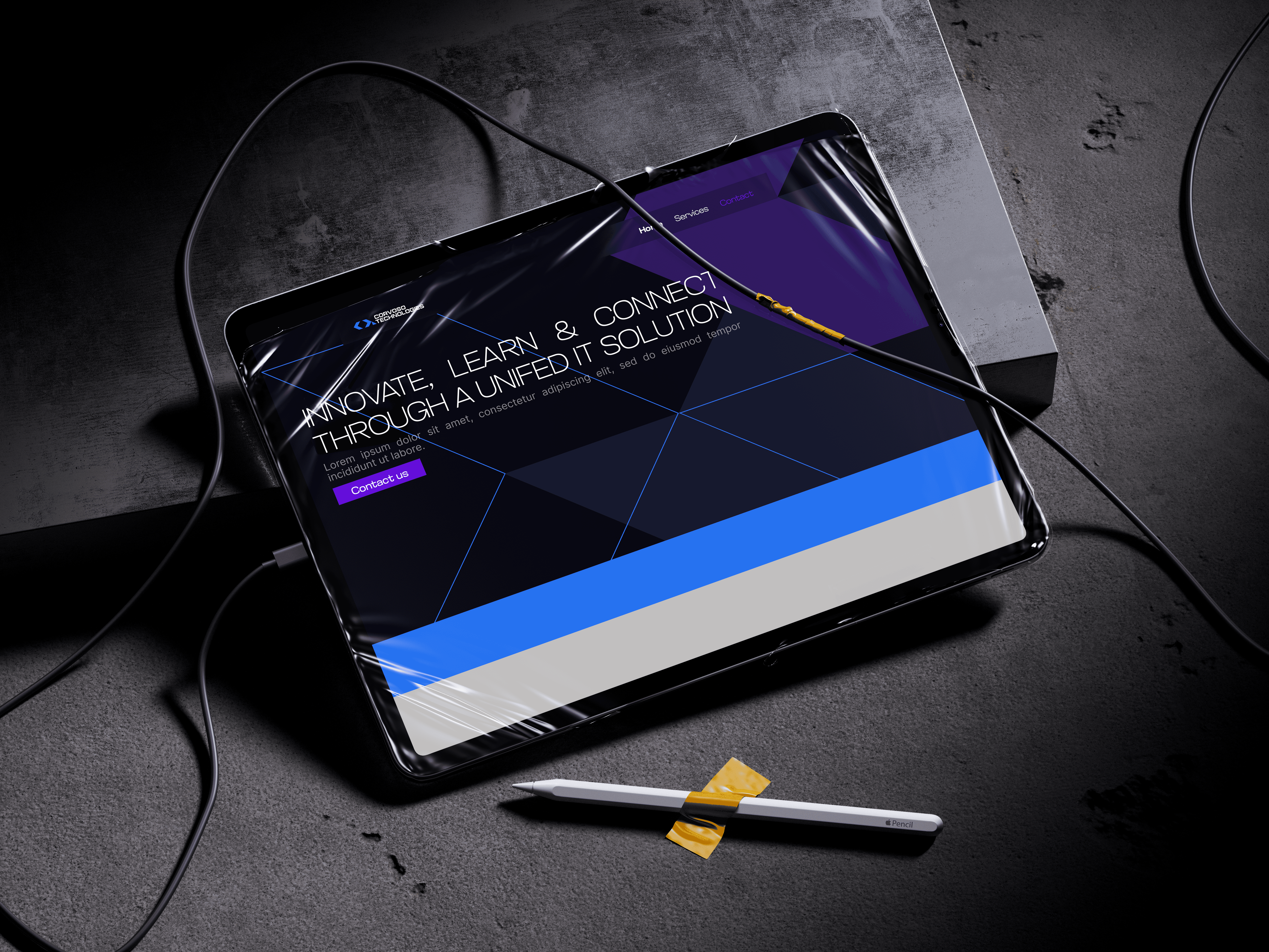
Core Concept – "Innovate, Learn, Connect": Inspired by their tagline, the identity aimed to visually embody these three pillars. This guided our choices in iconography, color, and overall aesthetic.
Logo System: The Corvoso logo features a stylized
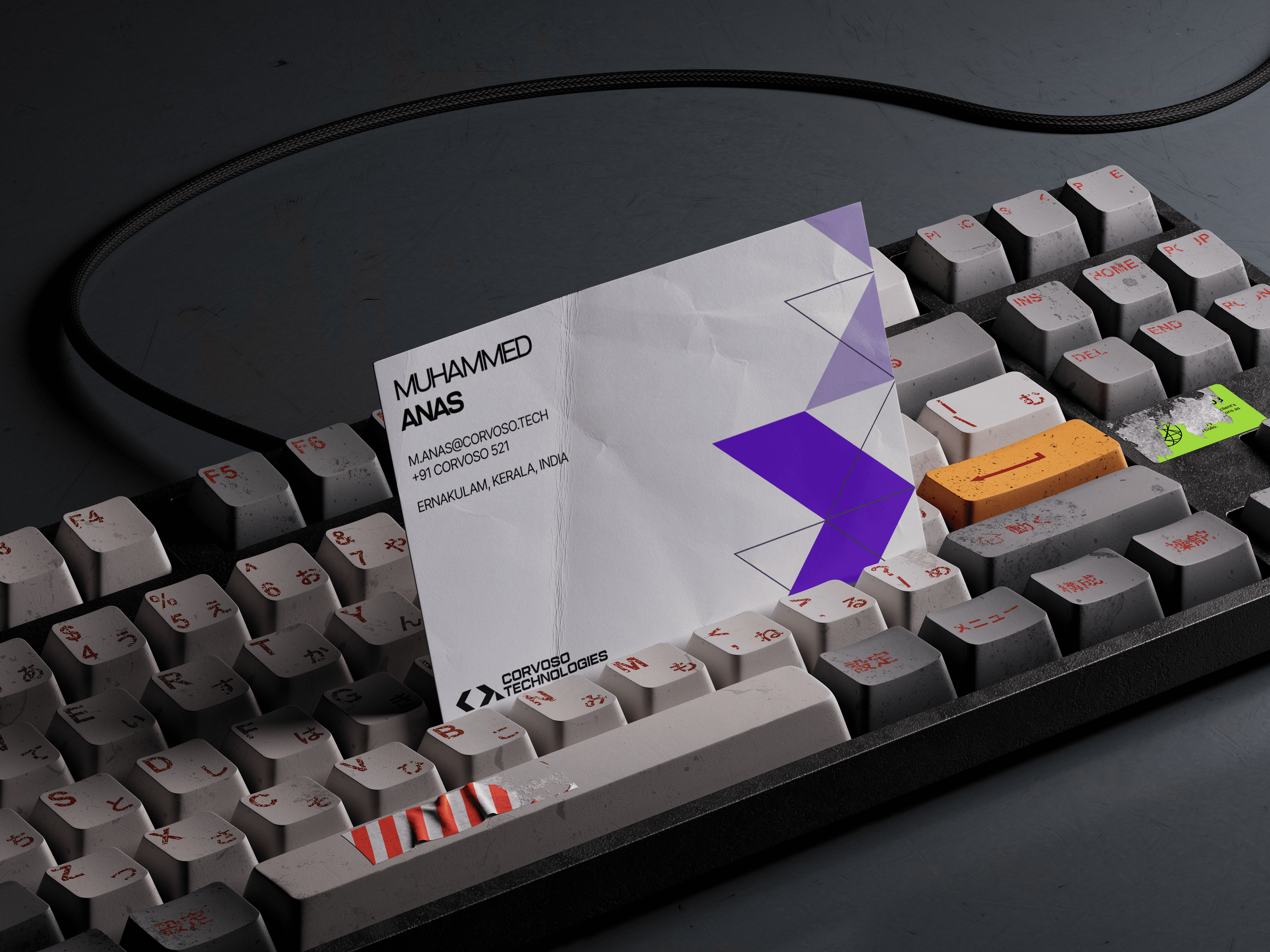
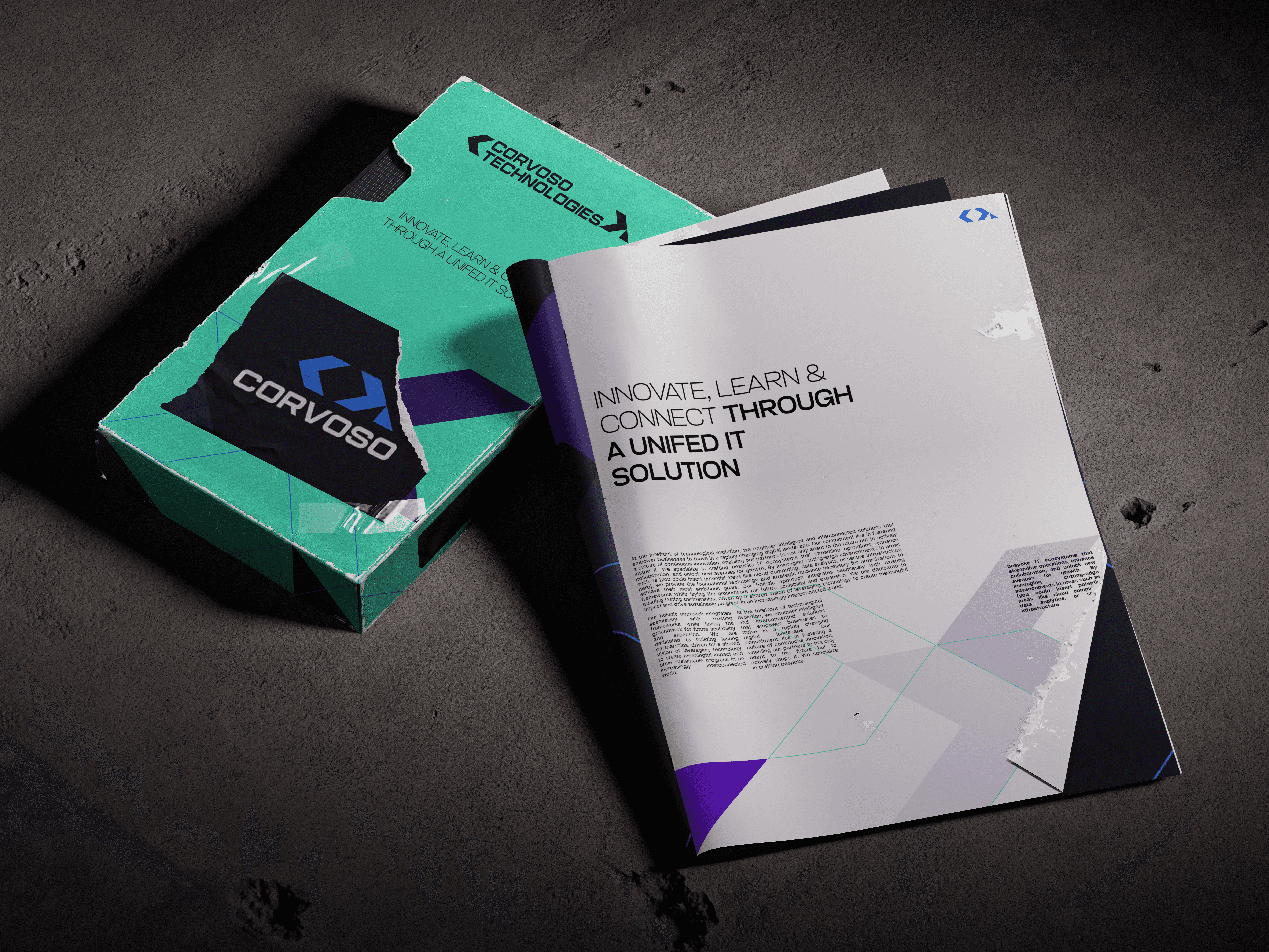
< >symbol. This mark is intentionally multifaceted: it alludes to coding brackets crucial in web/app development, suggests forward/backward navigation or progress, and can represent building blocks or modules in IT learning. The clever part of this brand mark is that it subtly denotes the letter C and T as well, This is paired with a clean, strong sans-serif wordmark for "CORVOSO TECHNOLOGIES," ensuring clarity and authority.Color Strategy: A sophisticated palette of deep blues and purples forms the foundation, conveying technological expertise, innovation, and depth of knowledge. Brighter accents, such as the teal/mint seen on the packaging, are used to introduce energy, clarity, and a sense of approachability, particularly relevant for educational materials.
Visual Language: Abstract geometric patterns and clean, dynamic lines (evident across all visuals) create a sense of structure, digital networks, and precision. This visual language supports the technical nature of software development and the structured approach of IT courses.
Versatile Application: The identity was designed for consistent and impactful application across all touchpoints. This includes professional business cards, informative brochures detailing IT solutions, and packaging that could house course materials or software.
Key Identity Components for Corvoso:
A meaningful and modern < > logomark paired with a strong typographic presence.
A dynamic color palette that balances technological sophistication with an inviting feel for learners.
A system of distinctive geometric graphics that reinforces the brand's tech focus.
A cohesive design language ensuring brand recognition across development services and educational offerings.
Positioning Corvoso Technologies for Growth:
The brand identity we crafted for Corvoso Technologies provides them with a robust and flexible visual system.
It empowers them to confidently engage with corporate clients seeking advanced IT development, while simultaneously welcoming individuals eager to enhance their tech skills through their courses. The identity clearly communicates their capacity to innovate, educate, and connect, truly offering a unified solution in the IT landscape.

More Works


FAQ
01
What does a project look like?
02
How is the pricing structure?
03
Are all projects fixed scope?
04
What is the ROI?
05
How do we measure success?
06
What do I need to get started?
Corvoso Visual Identity
Corvoso Technologies is an IT company specializing in developing cutting-edge websites and applications, alongside creating comprehensive IT courses. Our agency was tasked with designing a complete brand identity that would effectively communicate their dual expertise and establish a strong, modern presence in the technology sector.
IT
Brand Identity
Know More
A Unified Brand Identity for Development & IT Education.
The Design Challenge & Strategic Vision:
The primary challenge was to craft a cohesive brand identity that resonated with two distinct yet related audiences: businesses seeking sophisticated web and application development, and individuals looking for high-quality IT education. Our vision was to create a visual system that projected innovation, expertise, connectivity, and accessibility, all under the umbrella of Corvoso's "unified IT solution" ethos.
Our Design & Execution Philosophy:
We developed a brand identity for Corvoso Technologies rooted in clarity, modernity, and adaptability.
Core Concept – "Innovate, Learn, Connect": Inspired by their tagline, the identity aimed to visually embody these three pillars. This guided our choices in iconography, color, and overall aesthetic.
Logo System: The Corvoso logo features a stylized
< >symbol. This mark is intentionally multifaceted: it alludes to coding brackets crucial in web/app development, suggests forward/backward navigation or progress, and can represent building blocks or modules in IT learning. The clever part of this brand mark is that it subtly denotes the letter C and T as well, This is paired with a clean, strong sans-serif wordmark for "CORVOSO TECHNOLOGIES," ensuring clarity and authority.Color Strategy: A sophisticated palette of deep blues and purples forms the foundation, conveying technological expertise, innovation, and depth of knowledge. Brighter accents, such as the teal/mint seen on the packaging, are used to introduce energy, clarity, and a sense of approachability, particularly relevant for educational materials.
Visual Language: Abstract geometric patterns and clean, dynamic lines (evident across all visuals) create a sense of structure, digital networks, and precision. This visual language supports the technical nature of software development and the structured approach of IT courses.
Versatile Application: The identity was designed for consistent and impactful application across all touchpoints. This includes professional business cards, informative brochures detailing IT solutions, and packaging that could house course materials or software.
Key Identity Components for Corvoso:
A meaningful and modern < > logomark paired with a strong typographic presence.
A dynamic color palette that balances technological sophistication with an inviting feel for learners.
A system of distinctive geometric graphics that reinforces the brand's tech focus.
A cohesive design language ensuring brand recognition across development services and educational offerings.
Positioning Corvoso Technologies for Growth:
The brand identity we crafted for Corvoso Technologies provides them with a robust and flexible visual system.
It empowers them to confidently engage with corporate clients seeking advanced IT development, while simultaneously welcoming individuals eager to enhance their tech skills through their courses. The identity clearly communicates their capacity to innovate, educate, and connect, truly offering a unified solution in the IT landscape.
More Works
FAQ
What does a project look like?
How is the pricing structure?
Are all projects fixed scope?
What is the ROI?
How do we measure success?
What do I need to get started?