Unleashing Horror with Design
ESCAPE Interactive needed a visual identity for their horror festival, ESC APE, that would captivate audiences and embody the festival's eerie, thrilling atmosphere. The goal was to create a bold, unforgettable identity that stood out while staying true to the genre’s chilling essence.
We took on the challenge of designing a brand that’s as unsettling as it is eye-catching, blending horror with creativity to leave a lasting impression.
A Festival Identity That Strikes Fear
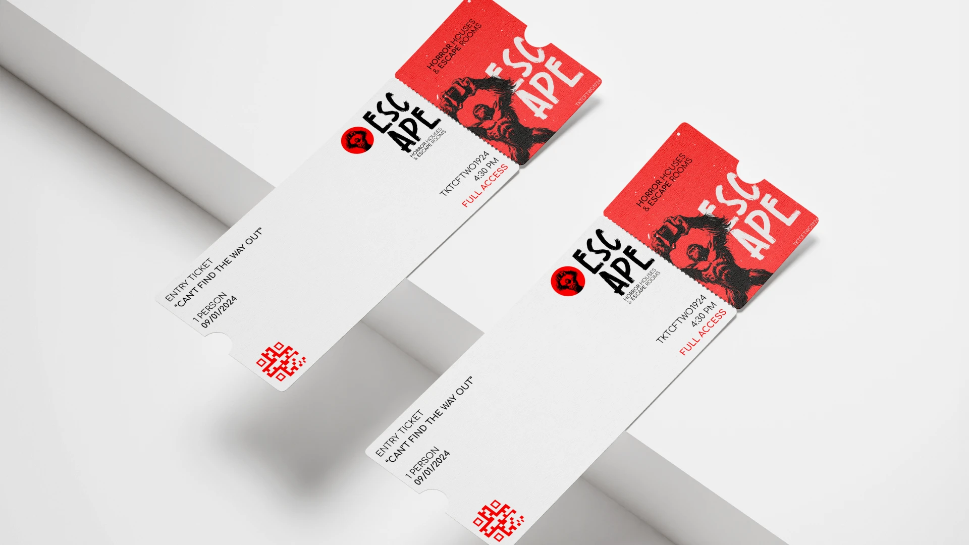
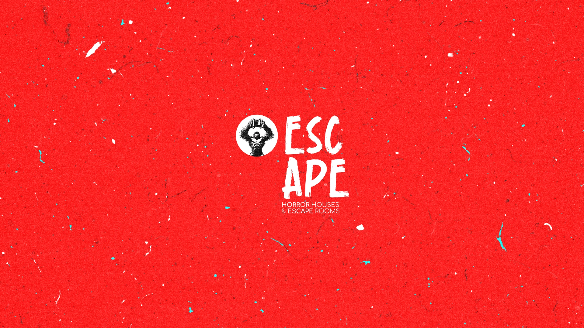
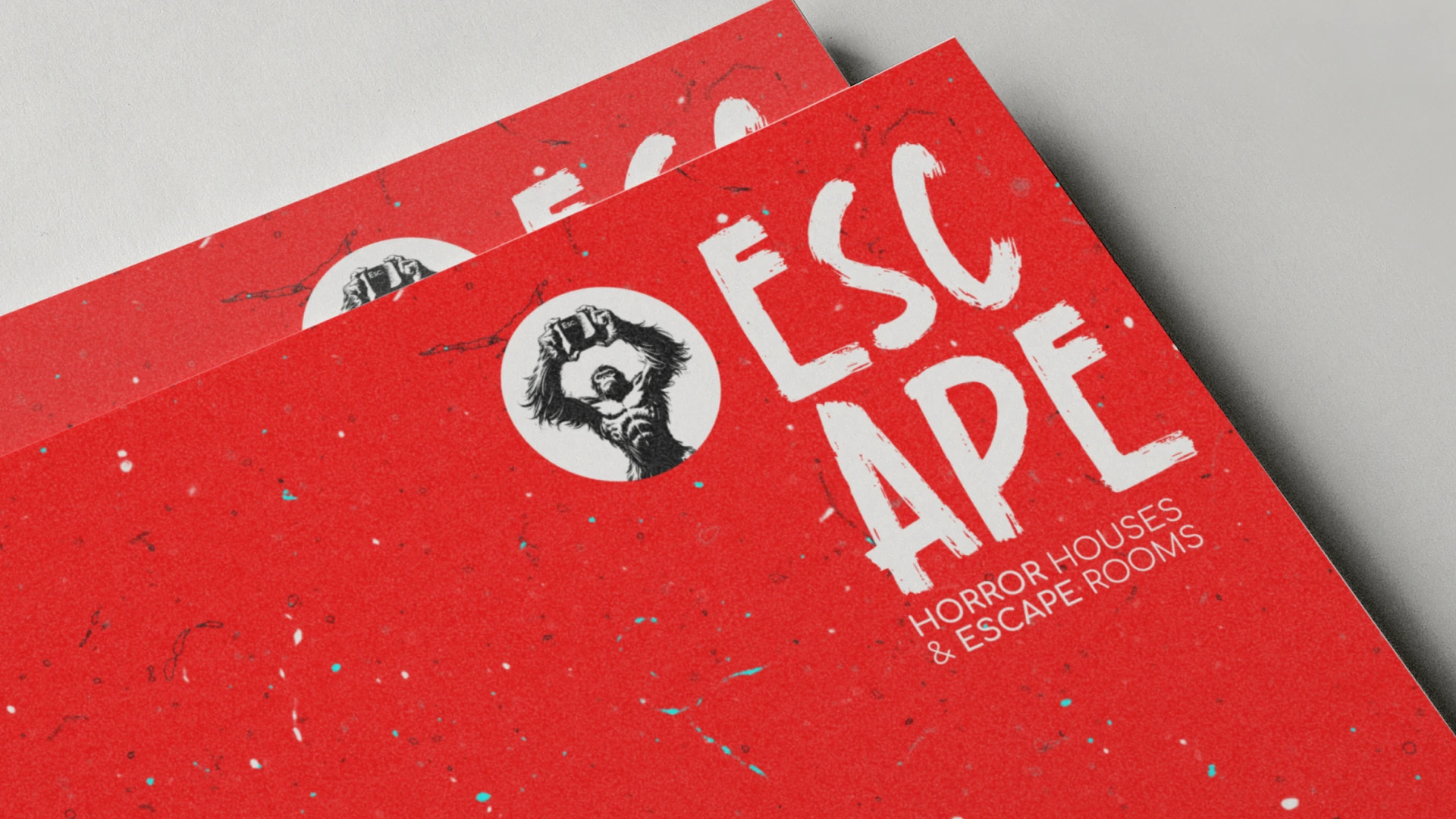
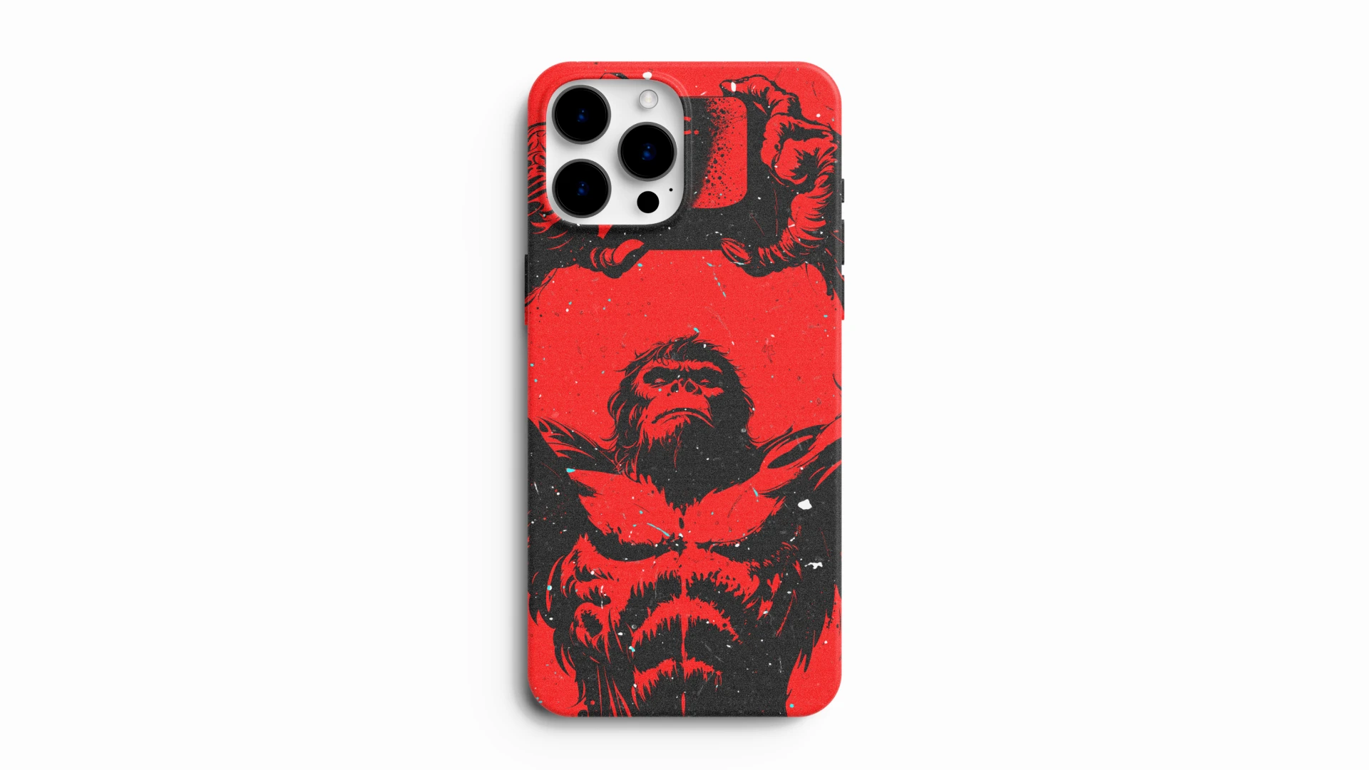
The visual identity for ESC APE uses a striking red-and-black color palette, evoking tension and drama. The bold, gritty illustrations and distorted typography mirror the chaos and thrill of the festival, while the custom textures add a sense of unease.
This design system was applied across digital and print assets, from posters to social media banners, ensuring a cohesive brand presence that’s as impactful as the festival itself. The result? A horror festival identity that captures attention and sets ESC APE apart as a must-attend event for thrill-seekers.